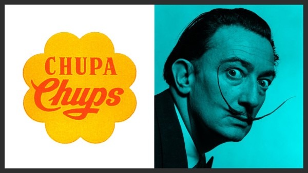
Salvador Dalí and the Chupa Chups Logo: A Surrealist Collaboration Done in a One Hour
Salvador Dalí, the iconic surrealist artist known for his imaginative works, left an unexpected mark on popular culture through his design of the Chupa Chups logo. In 1969, Dalí was commissioned by the Spanish confectionery brand to create a new logo that would be both eye-catching and easily recognizable.
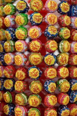
Salvador Dalí's solution was ingenious: His intention was to make the logo easily identifiable on the small candy wrappers so he placed the Chupa Chups brand name inside a daisy flower shape, colored both elements in a vibrant shade of red, and set them against a solid yellow background. This design choice cleverly references the traditional Spanish children's song "Debajo de un botón," which features a daisy.
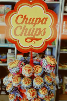
The combination of red and yellow not only embodies the essence of the brand but also ensures that Chupa Chups lollipops stand out prominently on store counters worldwide. One of Dalí's key innovations was the strategic placement of the logo on the lollipop wrappers. Unlike other candy brands at the time, which concealed their logos inside the wrapper, Dalí insisted that the Chupa Chups logo be prominently displayed on the top of the lollipop.
Dalí's involvement with Chupa Chups lasted until his death in 1989, and his logo design remains virtually unchanged to this day, a testament to its enduring appeal and Dalí's lasting influence on modern design and branding.
For more details, you can explore the Wikipedia page on Salvador Dalí and his artistic contributions.
Get Free Gifts & Best Stories!
Join our newsletter to get our top stories of the month and free merch.
- 📚 Cool Stories: Read stories you won’t find in textbooks.
- 🎁 Free Gifts: Get exclusive stickers, t-shirts, and more!
Only 1 email a month. No spam, we promise!